
Bedding and LifestyleBranding & LogoBrand Colours
April Studio
Client
April Studio (Fictional)
Role
Branding & Logo
Duration
August 5, 2026
Designer
Toki Studio
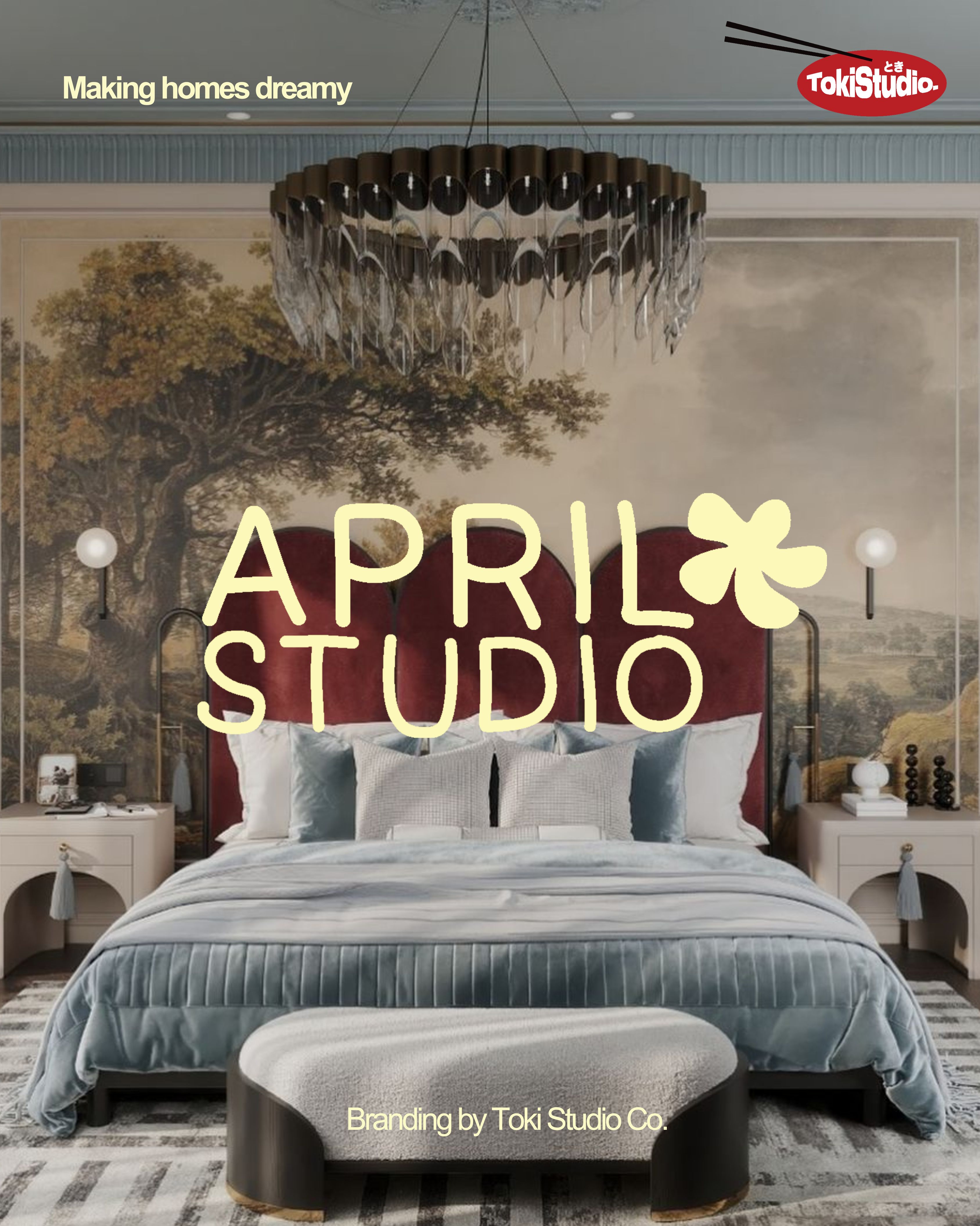
Brand overview
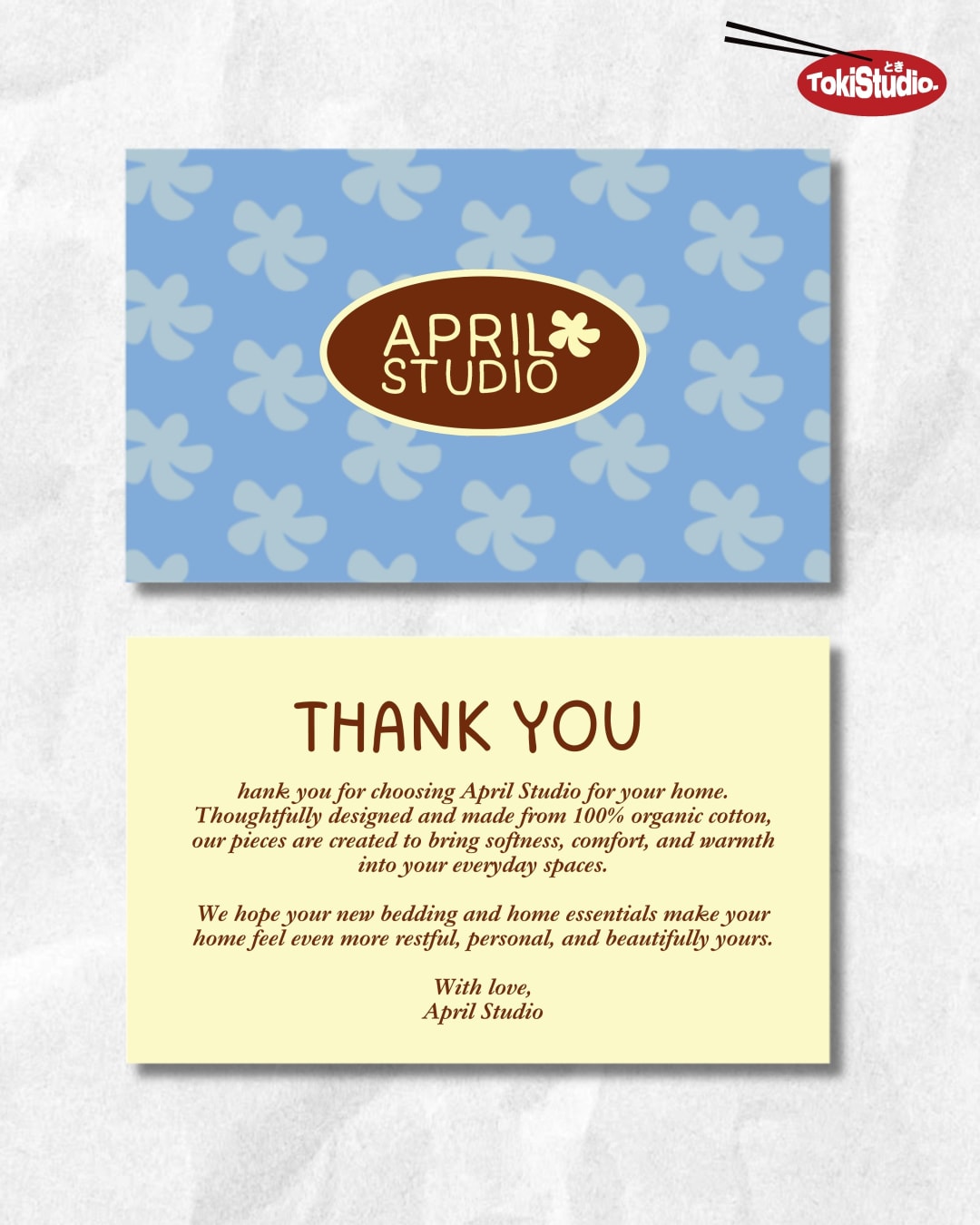
April Studio was imagined as a home and lifestyle brand creating thoughtfully designed bedding and everyday objects that make personal spaces feel warmer, happier and more expressive. The goal was to launch the brand with an identity that felt premium yet approachable, playful without appearing childish, and nostalgic while still feeling relevant to a modern audience.
Toki Studio was brought on to build the brand from the ground up, defining its visual language, personality and creative direction across packaging, social media and campaign imagery.
- Branding & Logo
- Brand Colours
- Social Media Posts

A complete branding & logo story shaped
for clarity, consistency, and measurable
brand momentum.
01. Challenge
The home and bedding category often leans towards either minimal, neutral luxury or highly decorative traditional design. April Studio needed to occupy a more distinctive space between the two. The challenge was to create an identity that could: Feel instantly recognisable in a crowded home and lifestyle market Communicate comfort and quality without appearing overly formal Bring personality to everyday products such as bedding and soft furnishings Appeal to a design-conscious audience while remaining warm and accessible Translate consistently across digital content, packaging, labels and physical products The brand also needed enough flexibility to support changing collections, patterns and seasonal colour stories without losing its core identity.02. Solution
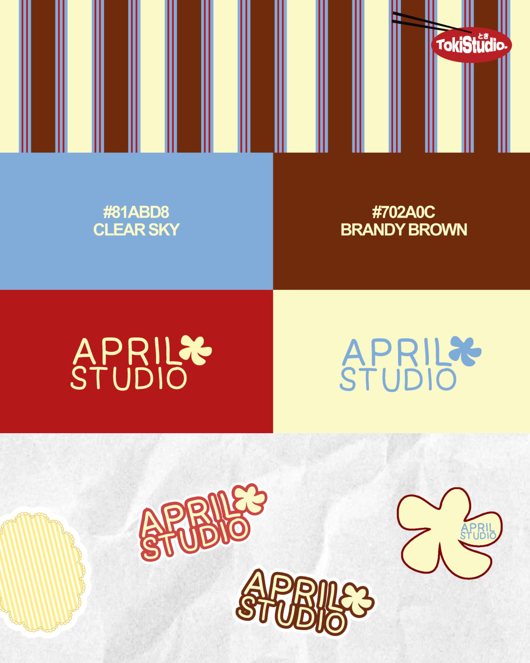
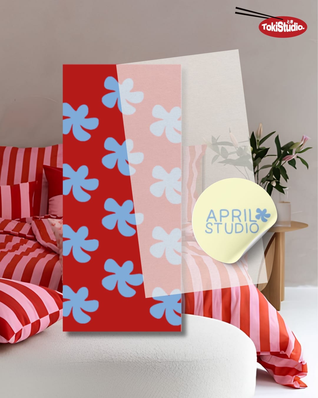
Toki Studio developed a warm, playful identity inspired by slow mornings, familiar patterns and the comfort of lived-in spaces. Rather than presenting the home as perfectly styled or untouched, the visual direction celebrates rooms that feel personal, layered and genuinely used. The identity combines soft nostalgia with clean, confident design. Stripes, checks and polka dots became key visual elements, referencing familiar household textiles while creating a flexible graphic system for the brand. A palette of clear sky blue, brandy brown, butter yellow and deep red was selected to balance freshness with warmth. These colours allow the brand to feel cheerful and optimistic while maintaining a refined, premium character.03. Results
Build a sharper presence with reusable assets, stronger recall, and a clearer path for future campaigns.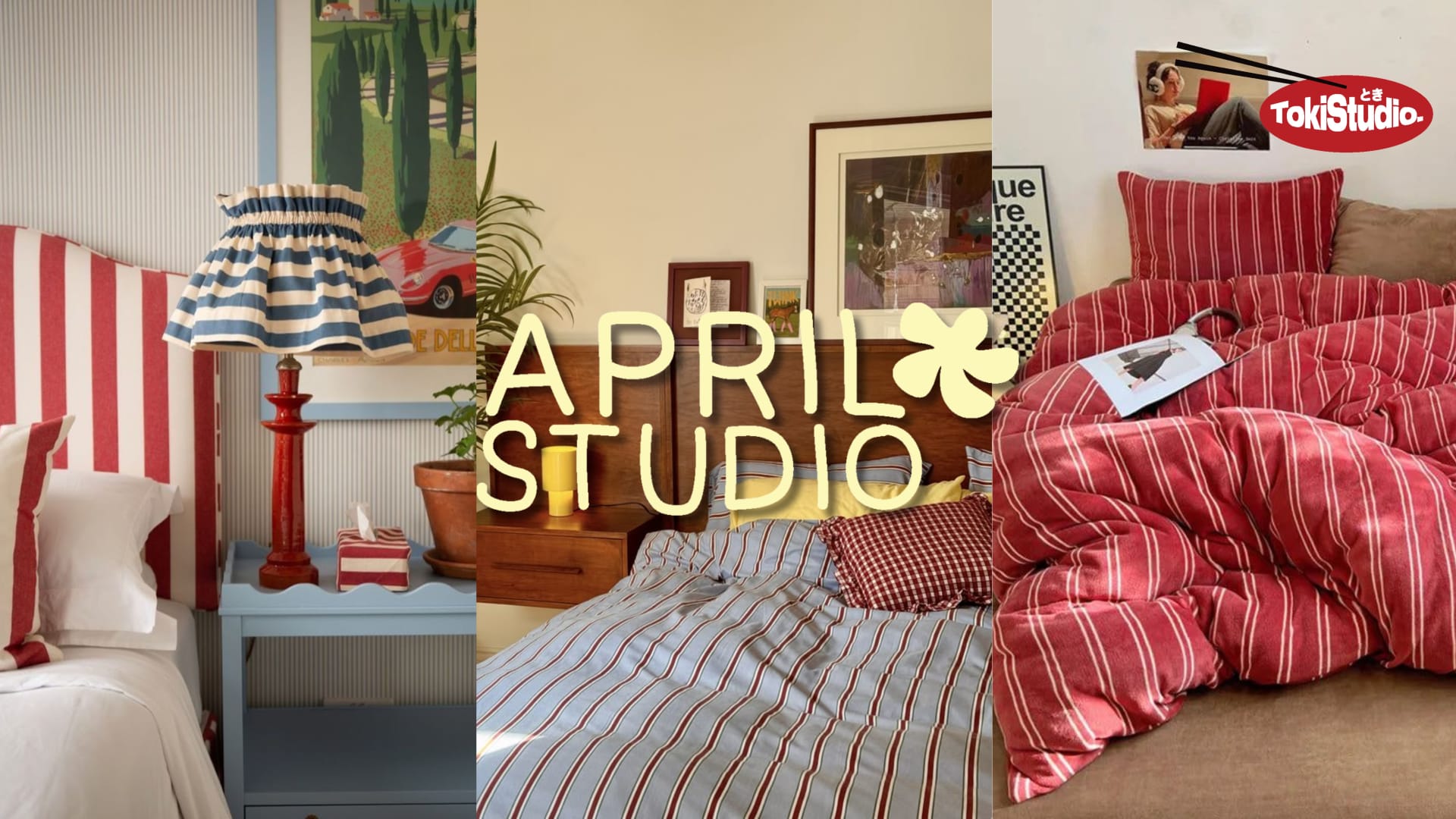
Interested in working with us?
We build brands, run social media and design the work that carries them — from Delhi, for anyone.